What is the halftone screen?
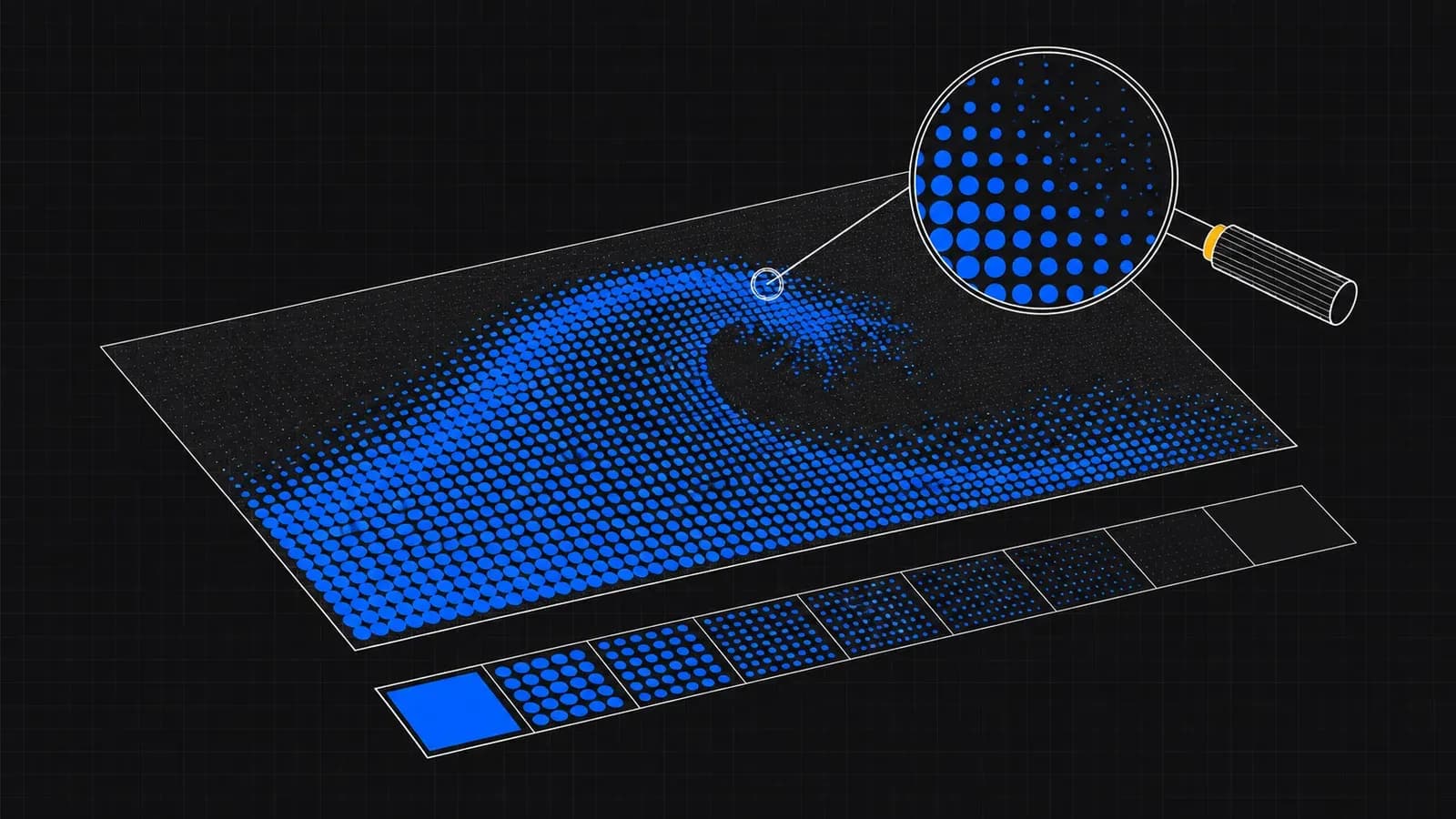
A DTF printer has CMYK + white inks: it can't lay down 'less ink' to lighten a colour, so it spreads smaller or more widely spaced dots. At normal viewing distance the eye integrates the dots and sees a continuous tone; up close, an ordered screen — just like the offset print of a magazine.
The RIP (the software that drives the printer) decides the shape, angle and frequency of that screen. That's why the same file can come out fine at one workshop and coarse at another: the screen is each printer's internal recipe.
Why do dots or banding sometimes show?
Visible dots appear in very light tones (below ~10-15 % ink): there are so few dots that the eye separates them. Banding appears in long, smooth gradients, when the jump between neighbouring percentages becomes visible as steps.
The third classic is the fade to full transparency: the edge where the design 'vanishes' ends in scattered dots on the garment, with the white base peeking through behind. On dark textiles that edge shows especially, because each colour dot carries its own white dot underneath.
How to prep your file so gradients look their best
Work at 300 dpi at real size: the screen has more resolution to build the tone with. Avoid gradients that fall below 10 % opacity — cut the gradient short or take it to a light solid colour. And if the design fades to transparent, give it a defined edge (a stroke, a fade that dies at 15-20 %).
Adding 1-2 % noise/grain to the gradient in Photoshop breaks up banding better than any printer setting: the steps dissolve into texture. It's the trick we use when a customer asks us to rescue a problem gradient.
- Long gradients: add 1-2 % noise to kill banding.
- Don't leave tones below ~10-15 %: either raise them or drop them.
- Fades to transparent: a defined edge beats scattered dots.
- Soft shadows on dark garments: test them first on A4.
What the workshop does for you
Our RIP works with fine stochastic screens at 720 × 2440 dpi: the dots are distributed pseudo-randomly, which hides light tones better than a classic grid screen and removes moiré with visibly woven fabrics.
Before printing we give every file a basic check (size, background and format), not a study of each gradient: that's why it pays to prepare them with these guidelines. If something obvious stands out, we'll tell you.
Cases where halftones are your friend
Tattoo-style illustrations, pencil shading and 'distressed vintage' effects live off the screen: designed directly with dots or grain (creative halftone), they print spectacularly in DTF because the effect IS the screen, with no reliance on impossible tones.
If that's your aesthetic, apply the halftone yourself in the design (Photoshop: Bitmap/Halftone, or grain textures) with dots of at least 0.3-0.4 mm: you'll have full control of the result instead of leaving it to the automatic screen.
- Print resolution
- 720 × 2440 dpi, stochastic screen
- Recommended file
- PNG at 300 dpi at real size
- Minimum printable tone
- ~10-15 % (less = visible dots)
- Anti-banding
- 1-2 % noise in the gradient
- Minimum dot in creative halftone
- 0.3-0.4 mm
- File check
- Basic: size, background and format