What is an ICC profile?
An ICC profile is a file that describes how a specific device reproduces colour: what real red your monitor produces when you ask it for 'red 255', or what ink mix our printer needs to nail that same red on DTF film. It's the dictionary that lets colour be translated between devices that 'speak' differently.
Without that translation, each device reads the numbers its own way: the same file looks saturated on your phone, dull on your laptop and printed… however luck decides. With profiles, colour travels with its meaning on its back.
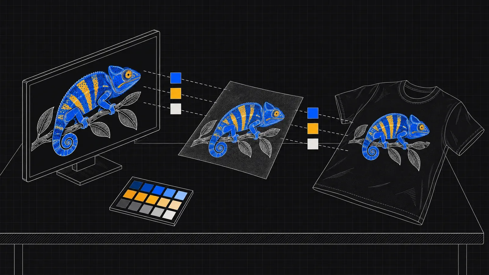
The colour journey: from your screen to the garment
Your design is born in RGB (light) and printed in CMYK + white (ink): the conversion is unavoidable and always clips something — there are screen colours no ink can reach, above all neons and some electric blues. Colour management decides WHAT is sacrificed and how, so the result is as faithful as possible.
In our workflow, your file is converted with ICC profiles calibrated for our exact combination of ink, film and screen: the same input always produces the same output. Fidelity doesn't depend on an operator 'tweaking by eye'.
How to prep your file to get it right first time
Work and export in sRGB — it's the space everyone reads the same way and our standard entry point. Adobe RGB or Display-P3 only if you know what you're doing: more gamut on screen that then has to be clipped, with surprises if the file travels without its embedded profile.
And always, always embed the profile when exporting ('Convert to sRGB' + 'Embed profile' in Photoshop/Illustrator). A file with no profile forces us to guess what its numbers meant — we flag it as UNMANAGED and assume sRGB, but with you embedding it there's nothing to assume.
- Export in sRGB with the profile embedded: it's the safe route.
- Press CMYK (FOGRA/coated) adds nothing in DTF: leave it in RGB.
- Screen neons don't exist in ink: ask for real fluoro if you need it.
- Your uncalibrated monitor lies: distrust it, not the transfer.
And if colour is critical? (brands, franchises)
When the corporate colour is sacred — the exact blue of your logo — the reference can't be a screen: it's a physical sample. Order an A4 with the design first: for €2.95 you see the real colour on film before committing to metres.
With the sample in hand, any adjustment is made once and locked in for your restocks: our ICC workflow guarantees that metre 40 comes out exactly as the test A4 did.
The honest limits of colour on textiles
The same transfer looks different on white cotton than on black polyester: the DTF white base insulates a great deal, but the fabric, its texture and the ambient light still shape perception. No printing process removes that.
Our measurable promise is consistency: same file, same colour, today and in the restock six months from now. Against the physics of dyes and uncalibrated screens, the best tool is the physical sample — cheap, fast and definitive.
- Recommended working space
- sRGB with embedded profile
- Conversion at the workshop
- ICC calibrated for ink + film + screen
- Files with no profile
- sRGB assumed (flagged UNMANAGED)
- Out-of-gamut colours
- Screen neons: they don't exist in CMYK
- Physical colour proof
- A4 from €2.95 before running metres
- Consistency
- Same file = same colour on restocks